HELOC Fastline
Overview
HELOC Fastline was a strategic initiative to modernize Citizens Bank’s home equity lending experience, transforming a slow, fragmented process into a streamlined digital product.
The original experience required extensive manual input, long processing timelines, and inconsistent onboarding flows - creating friction for users and limiting adoption.
By rethinking the onboarding experience and aligning it with user behavior, the redesigned product enabled applications to be completed in minutes and contributed to over $10B in originations and $120M in net present value.
The Problem
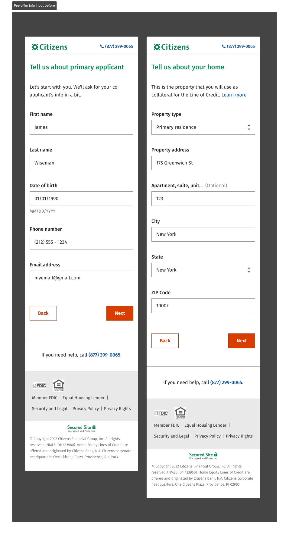
The onboarding experience for HELOC applications was fragmented and confusing.
Users entered the application through three different paths:
- Walk-in applicants
- Users with invite codes (non-customers)
- Existing customers with invite codes
Each path had its own flow, with inconsistent steps and logic.
This created several issues:
- Users encountered different experiences depending on entry point
- Invite code failures caused confusion and drop-off
- Redundant data entry increased friction
- Key steps in the process were unclear, blocking users from completing their application
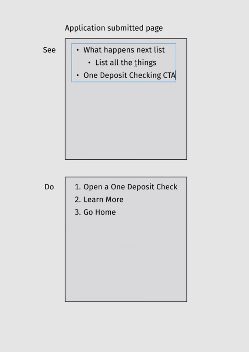
One critical issue was a waiver step that required users to open and review a document before confirming submission - but the interaction was unclear. Users were unable to proceed, leading to significant drop-off at a key conversion point.
The result was a high friction experience that limited adoption and slowed down the lending process.
Constraints & Challenges
This project required navigating both product and organizational constraints:
- Fragmented onboarding logic, with multiple flows built around user entry points rather than user needs
- Legacy thinking around requirements, where solutions were defined before fully understanding the problem
- Limited use of data in decision making, requiring a shift toward analytics-driven design
- Process inefficiencies, including reliance on Figma for copy updates instead of structured workflows in Jira
Additionally, aligning on a more strategic, user centered approach required building a stronger partnership with the product owner and shifting how design was integrated into the product process.
My Role & Ownership
I led the redesign of the HELOC onboarding experience as part of the Trailblazers team, owning the end-to-end product design process.
My role extended beyond UX execution into product strategy and decision making, where I:
- Partnered with data analytics to identify drop off points and user friction across the onboarding flow
- Used data and user feedback to inform design decisions and prioritize improvements
- Unified fragmented onboarding flows into a single, scalable experience
- Redefined key interactions to reduce friction and improve completion rates
- Influenced product direction by grounding recommendations in data, enabling more effective stakeholder alignment and pushback
- Helped shift team processes toward more efficient workflows, reducing time spent on low impact tasks and enabling focus on higher value design problems
This work required balancing user needs, business goals, and technical constraints while driving meaningful improvements in both the product experience and team collaboration.
Key Product Decisions
1. Unifying Fragmented Onboarding Flows
The existing onboarding experience was split across three separate flows based on how users entered the application.
While these flows served similar purposes, they differed significantly in structure and logic - creating confusion, especially when invite codes failed or users entered through the wrong path.
Decision: Consolidate multiple onboarding flows into a single, unified experience.
Instead of designing for entry points, I redesigned the experience around a consistent set of steps that applied to all users, with conditional logic handling differences such as pre-filled data.
This approach:
- Reduced cognitive load for users
- Eliminated inconsistencies between flows
- Simplified implementation for engineering
By shifting from fragmented flows to a unified system, the onboarding experience became more intuitive and scalable.
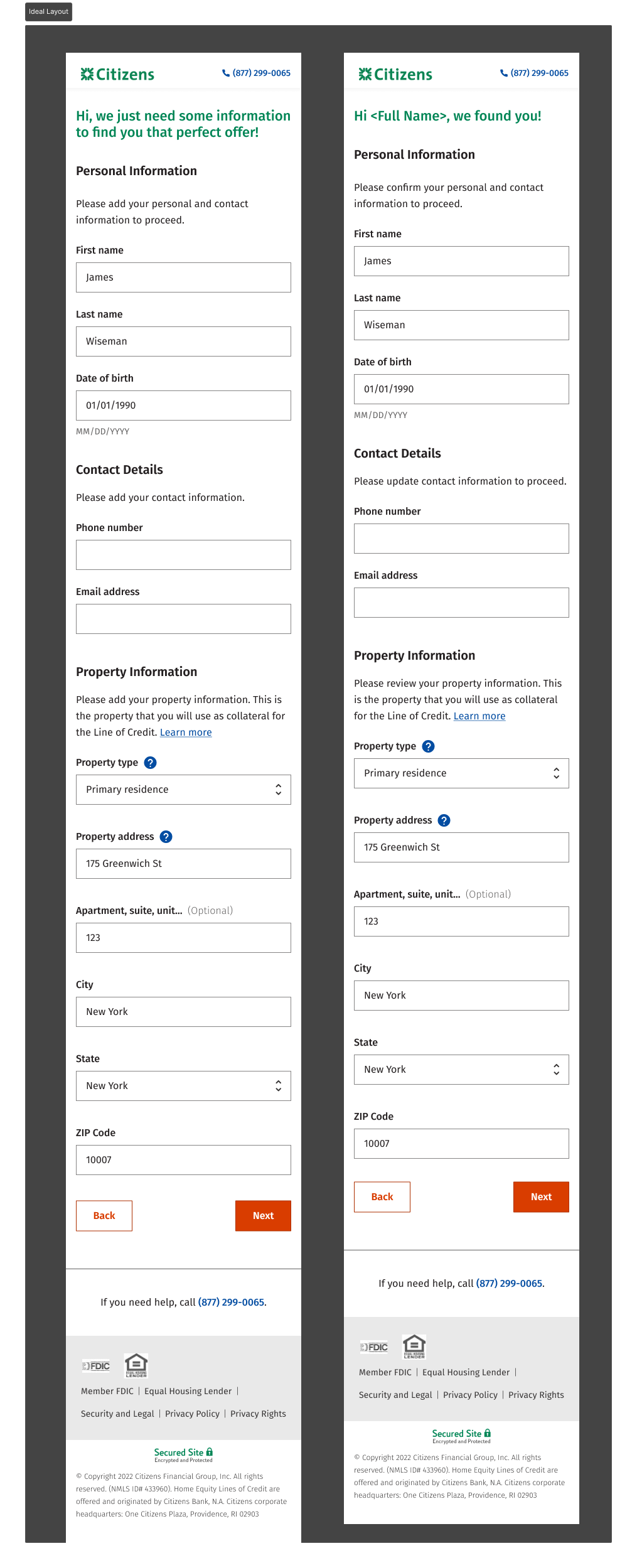
2. Simplifying the Application Flow
A major source of friction in the onboarding experience was the number of steps required to complete the application.
Users were required to move through multiple screens to input information, even when those inputs were related. This created unnecessary transitions, slowed down completion, and made it harder for users to understand their progress.
Decision: Consolidate fragmented steps into a streamlined, single-page experience with structured grouping.
I redesigned the input flow to:
- Combine related inputs into a single, cohesive view
- Group fields logically to support faster scanning and comprehension
- Leverage pre-filled data where possible to reduce manual effort
- Align the experience with familiar industry patterns
This approach reduced the number of steps required to complete the application while maintaining clarity and usability.
By minimizing unnecessary transitions and improving information hierarchy, the experience became:
- Faster to complete
- Easier to understand
- More aligned with user expectations
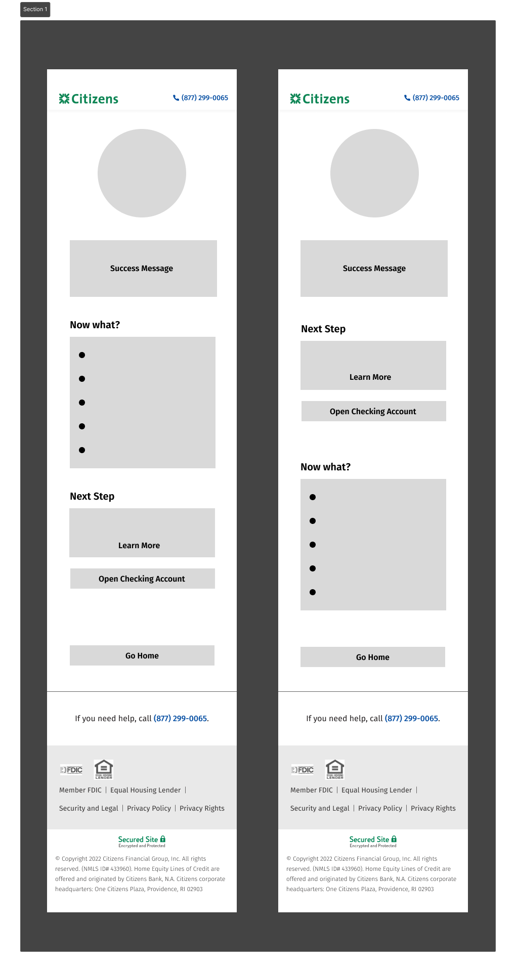
Before: Multi-step input flow
After: Consolidated, structured input experience
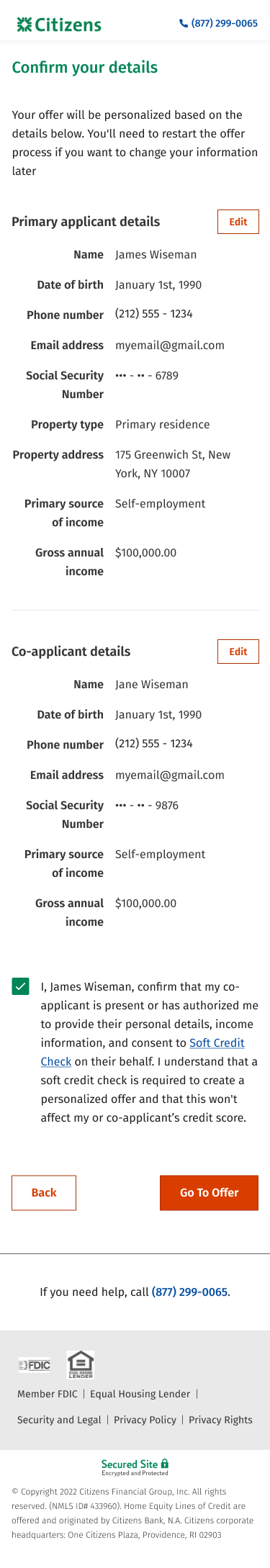
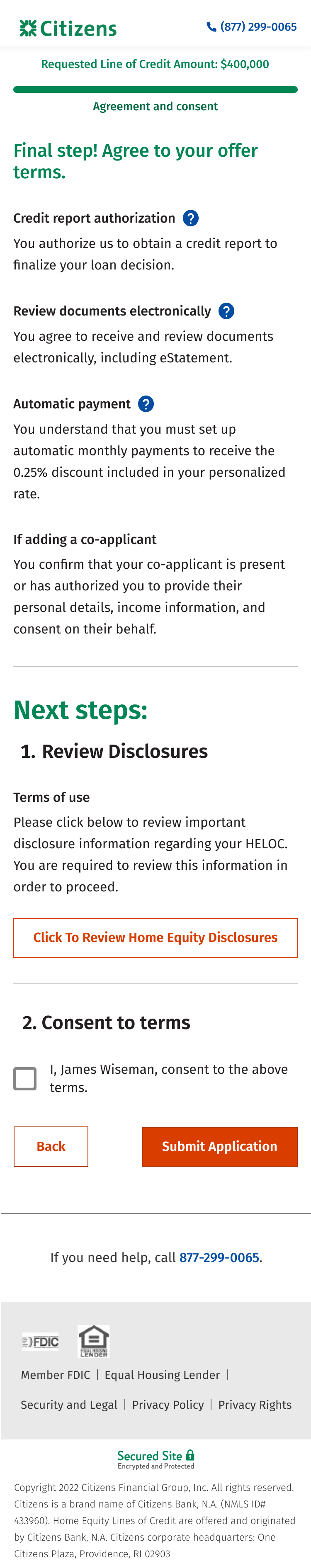
3. Fixing a Critical Conversion Blocker (Waiver Step)
One of the most significant drop-off points in the onboarding flow was the waiver step.
Users were required to open and review a document before confirming submission—but the interaction design made this requirement unclear. As a result, users were unable to proceed, leading to unnecessary abandonment at a critical stage.
Decision: Redesign the waiver interaction to clearly guide users through the required steps.
I restructured the experience into a clear sequence:
- Step 1: Open and review the waiver
- Step 2: Confirm acknowledgment and proceed
This included both interaction and copy improvements to remove ambiguity.
By making this requirement explicit and easy to follow, the redesign:
- Removed a major point of confusion
- Significantly improved completion rates
- Reduced friction at a key conversion moment
This simplification contributed to faster completion times and reduced friction throughout the onboarding process.
4. Shifting to Data-Driven Product Decisions
At the start of the project, design decisions were often driven by assumptions rather than user data.
Decision: Partner with data analytics to identify real user friction and guide design improvements.
I worked closely with the analytics team to:
- Identify where users were dropping off
- Understand patterns in user behavior
- Prioritize high-impact areas for redesign
This data became a critical tool in:
- Validating design decisions
- Driving product strategy
- Strengthening stakeholder alignment
It also enabled more effective pushback on unclear or low-impact requirements, ensuring the team focused on solving the right problems.

Impact
The redesign of the HELOC onboarding experience transformed a fragmented, high-friction process into a streamlined, scalable product.
Key outcomes include:
- Reduced origination timeline from ~50 days to ~2 weeks
- Enabled applications to be completed in minutes
- Reduced required form fields by 50%, significantly lowering user friction
- Improved application completion rates, including a ~40–50% increase after resolving key blockers
- Increased Net Promoter Score (NPS) into the mid-80s
The product also drove substantial business impact:
- $10.8B in originations (+26.3%)
- $6.78B in funded loans (+31.4%)
- $120M in net present value
Following launch, Citizens became #1 in HELOC market growth (2022) and received the 2023 Elevate Award for CX Excellence.
Reflection
This project was a turning point - not just for the product, but for how UX was perceived. I helped transform Fastline from a failing experience into a flagship product, and in the process, helped shape a stronger partnership between design, product, and data.